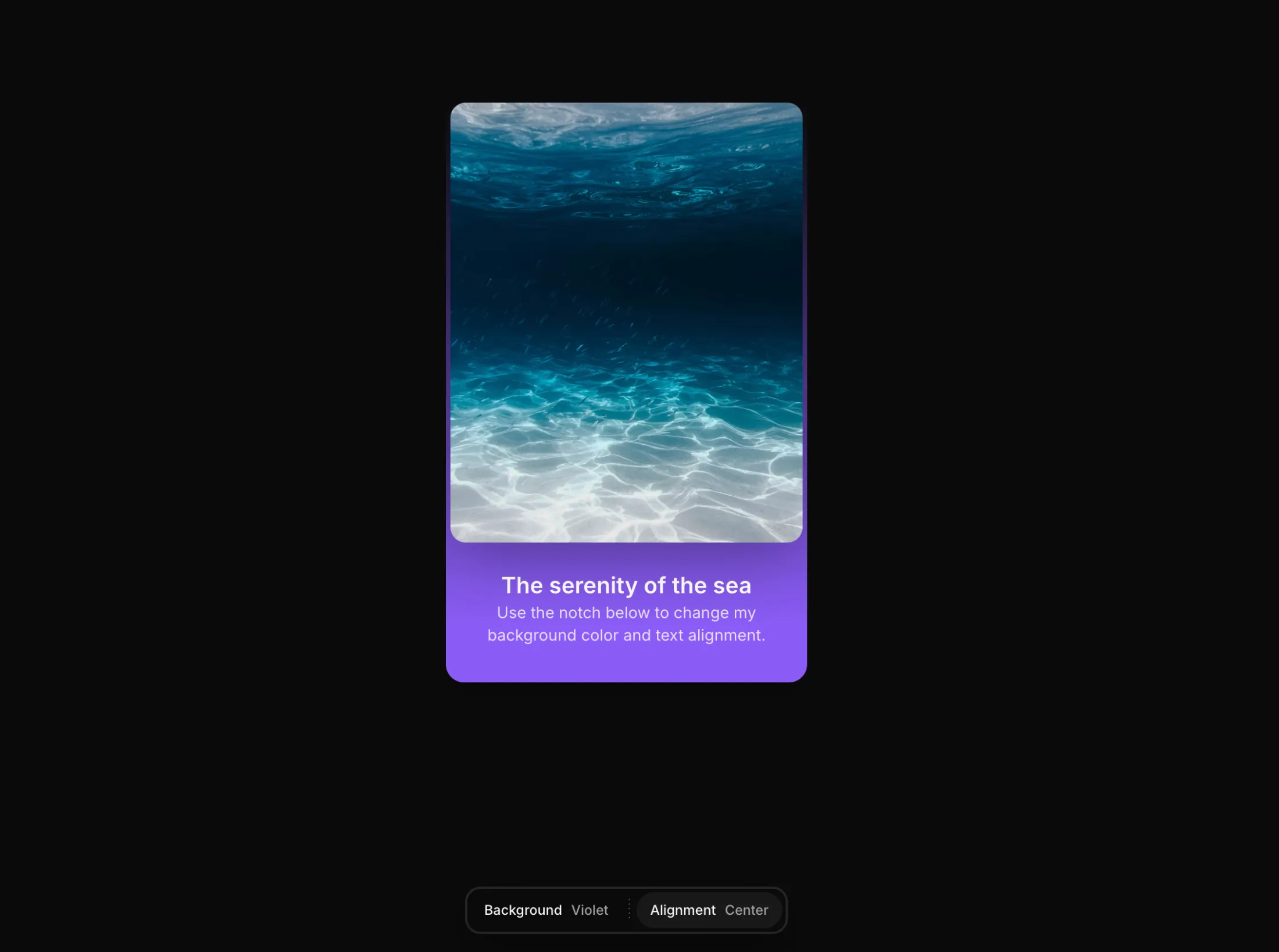
Tab Switcher – Aceternity UI 组件
A tab switcher component with Aceternity UI style animations and effects.
@aceternity/tab-switcher-demo

"use client";
import React from "react";
import { motion, useMotionValue, useSpring } from "framer-motion";
import { cn } from "@/lib/utils";

export const TabSwitcher = ({
    className,
    children,
  }) => {
  const mouseX = useMotionValue(0);
  const mouseY = useMotionValue(0);
  const springConfig = { damping: 20, stiffness: 300 };
  const x = useSpring(mouseX, springConfig);
  const y = useSpring(mouseY, springConfig);

  const handleMouseMove = (e) => {
    mouseX.set(e.clientX - e.currentTarget.getBoundingClientRect().left);
    mouseY.set(e.clientY - e.currentTarget.getBoundingClientRect().top);
  };

  return (
    <motion.div
      onMouseMove={handleMouseMove}
      className={cn("group relative overflow-hidden", className)}
    >
      <motion.div
        className="pointer-events-none absolute -inset-px opacity-0 transition-opacity group-hover:opacity-100"
        style={{
          background: `radial-gradient(300px circle at ${x}px ${y}px, rgba(168,85,247,0.1), transparent 80%)`,
        }}
      />
      {children}
    </motion.div>
  );
};
安装
npx shadcn@latest add @aceternity/tab-switcher
A tab switcher component with Aceternity UI style animations and effects.
## 概述
Tab Switcher 是 Aceternity UI 组件库中的一个精选组件,专为 React + Tailwind CSS 项目设计。它提供了流畅的动画效果和现代化的视觉体验,可以轻松集成到你的项目中。
## 特性
- **React + TypeScript** 支持,类型安全
- **Tailwind CSS** 样式,响应式设计
- **Framer Motion** 动画引擎,流畅自然
- **复制即用**,无需额外安装依赖
- **暗色模式**兼容
- **SSR/SSG**友好,支持 Next.js
## 使用场景
1. **产品落地页** - 为你的产品页面添加视觉冲击力
2. **后台管理系统** - 提升管理界面的用户体验
3. **个人作品集** - 展示你的技术实力
4. **SaaS 应用** - 为用户提供现代化的界面
5. **内容展示** - 以引人入胜的方式展示内容
## 技术栈
- React 18+
- Tailwind CSS 3+
- Framer Motion / Motion
- TypeScript(可选)
## 兼容性
| 框架 | 支持状态 |
|------|---------|
| Next.js 14+ | 完全支持 |
| Vite + React | 完全支持 |
| Create React App | 支持 |
| Remix | 支持 |
| Astro + React | 支持 |
## 注意事项
- 确保已安装 `framer-motion` 和 `tailwindcss`
- 组件使用 `"use client"` 指令,适用于 App Router
- 所有组件均支持暗色模式
- 建议在 `tailwind.config.js` 中配置 `cn` 工具函数
Examples
Basic Usage
@aceternity/tab-switcher-demo
"use client";
import React from "react";
import { motion } from "framer-motion";

export const TabSwitcher = ({ text, className }) => {
  const words = text.split(" ");
  return (
    <motion.h1 className={className}>
      {words.map((word, i) => (
        <motion.span
          key={i}
          initial={{ opacity: 0, filter: "blur(10px)" }}
          animate={{ opacity: 1, filter: "blur(0px)" }}
          transition={{ delay: i * 0.1 }}
          className="inline-block mr-2"
        >
          {word}
        </motion.span>
      ))}
    </motion.h1>
  );
};
With Custom Props
@aceternity/tab-switcher-custom-demo
"use client";
import React from "react";
import { motion } from "framer-motion";
import { cn } from "@/lib/utils";

export const TabSwitcher = ({ children, className, onClick }) => {
  return (
    <motion.button
      whileHover={{ scale: 1.05 }}
      whileTap={{ scale: 0.95 }}
      onClick={onClick}
      className={cn(
        "relative inline-flex h-12 overflow-hidden rounded-full p-px",
        "bg-gradient-to-r from-indigo-500 to-purple-500",
        className
      )}
    >
      <span className="relative z-10 flex h-full w-full items-center justify-center rounded-full bg-neutral-950 px-6 py-1 text-white">
        {children}
      </span>
      <motion.span
        className="absolute inset-0 bg-gradient-to-r from-transparent via-white/20 to-transparent"
        initial={{ x: "-100%" }}
        whileHover={{ x: "100%" }}
        transition={{ duration: 0.5 }}
      />
    </motion.button>
  );
};
Props
| Prop | Type | Default | Description | Required |
|---|---|---|---|---|
className |
string |
"" |
Additional CSS classes | No |
children |
React.ReactNode |
- |
Child elements | Yes |
variant |
"default" | "outline" | "ghost" |
"default" |
Visual variant | No |
duration |
number |
0.5 |
Animation duration in seconds | No |