COMPONENT / 导航 / V0.9.0
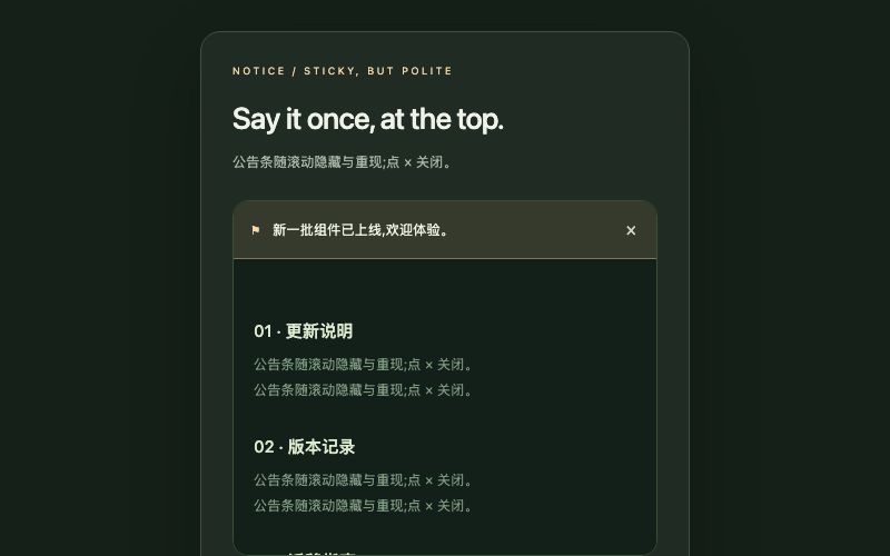
Notice / 吸顶横幅
顶部公告条:下滑隐藏、上滑重现,可关闭;仅本地状态。
可调字段
| 键 | 名称 | 类型 | 范围 |
|---|---|---|---|
accent | 强调色 | color | — |
radius | 圆角 / px | number | 0 – 40 |
duration | 过渡时长 / ms | number | 100 – 30000 |
title | 标题 | text | — |
subtitle | 说明 / 展开内容 | textarea | — |
label | 按钮或内容文字 | text | — |
items | 内容列表(每行一项) | list | — |
默认参数
{
  "accent": "#f5d9a8",
  "radius": 18,
  "duration": 360,
  "title": "Say it once, at the top.",
  "subtitle": "公告条随滚动隐藏与重现;点 × 关闭。",
  "label": "新一批组件已上线,欢迎体验。",
  "items": [
    "更新说明",
    "版本记录",
    "迁移指南"
  ]
}
运行依赖
react@18.3.1react-dom@18.3.1
许可
FORMA原创组件,可用于个人及商业项目;运行库遵循MIT许可。
查看实时预览 ↗返回组件中心